This chart is weird but effective
Take a look at this chart. Pretty interesting right?
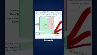
It’s a chart that shows where Spotify gets its money, and how it spends it. According to the chart, for every $12.68 of revenue, Spotify spends $9.34 on payments to musicians and record labels. Then most of the rest is split between various operating costs like marketing and R&D, with the final 12 cents leftover as operating profit.
This type of chart is called a Sankey Diagram, and they’re great for showing the flow of something, like money or energy.
Here’s another one from the economist. The left hand side shows the total crude oil exports from Russia, then this middle stage shows where that oil goes for refinement, and the final stage is where the refined oil is imported.
Sankey diagrams can be great for a few reasons. First is that they’re intuitive for most people. When I look at this I can pretty easily understand what’s happening. And if I wanted to follow the flow of oil from Russia to India to Australia, it wouldn’t take much effort.
They’re also good for showing relative scale. This one shows Walmart’s revenue breakdown, and you can get a good visual representation of how much profit they make on nearly half a trillion in revenue, in this case about 2%.
But of course Sankey Diagrams should be used with caution. They can get complicated quickly with too many flows, and they don’t do a good job of showing precise comparisons. Plus they can be hard to build without special 3rd party apps or data visualization software like Tableau or Power BI.
But in the right circumstances, and with the right audience, they can be a great way to visualize your data.
=============================================
📣 FREE STUFF
1-Month Ampler Subscription* ☞ https://bit.ly/3tFq4Ze
SlideStart (Slide Database) ☞ https://bit.ly/3HctLIM
Slide Building Course ☞ https://bit.ly/3v5vcCZ
Umbrex Template ☞ https://bit.ly/3S7dxar
🏆 COURSES
Presentation Design Course ☞ https://bit.ly/3UJJi88
Data Visualization Course ☞ https://bit.ly/3TKt11s
PowerPoint Speed Course ☞ https://bit.ly/3hOxjaM
Courses for Teams ☞ https://bit.ly/3H4YSGv
🎬 VIDEOS
• The 5 Most Popular Consulting Slides (and ...
• Ugly PowerPoint Slides? It's Probably Your...
• How I redesigned 3 McKinsey slides (and ma...
• How McKinsey creates million dollar charts...
🚀 MORE STUFF
Follow us on Instagram ☞ https://bit.ly/3H7S3ny
Connect on LinkedIn ☞ https://bit.ly/41T7SIk
Paul's LinkedIn ☞ https://bit.ly/3tyAOsr
*Affiliate relationship
=============================================
ABOUT US
At Analyst Academy, we teach high-value consulting skills found at the world's top consulting firms. Our clients include small businesses, Fortune 500 companies, universities, and individual students in 100+ countries around the world. Each of our courses combine years of knowledge from high-performing consultants into highly engaging lessons packed full of best practices, time-saving tricks, and some of the industry's best kept secrets. Our downloads, courses, and articles are all inspired by best practices from the consulting industry. Learn more at https://www.theanalystacademy.com
All views expressed on this channel are that of Analyst Academy LLC and its employees. Any materials mentioned or shown have been obtained through publicly available sources (e.g. firm or client website).
#powerpoint #presentations #consulting #datavisualization