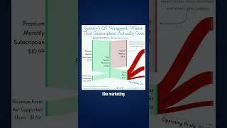
This Harry Potter chart is not like other charts
Take a close look at this chart, notice anything strange?
It’s a chart that shows how well different Harry Potter characters are represented in the movies.
The X-axis shows the number of mentions they were given in the books, and the Y-axis shows how many minutes of screen time they had in the movies. So for example, Percy Weasley had less than 10 minutes of screen time, despite being mentioned in the books almost 500 times.
By plotting it like this you can see how well each character was represented, above the line means they were over-represented in the movies, and below the line means they were under-represented.
But what’s interesting about this chart is that they used a logarithmic scale. If you look closely you can see that the Y-axis goes from 10 to 100 to 1,000, instead of from 10 to 20 to 30, etc. And the X axis follows the same pattern.
If you’re like me you learned about log scales in school but never really applied them in the real world. But this chart provides a great example of how they can be helpful.
The main characters up here like Harry, Ron, and Hermione had multiple thousands of mentions in the books, and hundreds of minutes of screen time. So if you would have plotted them on a regular scale, they’d be way up in the top right corner, while the rest of the characters would have been clumped down here at the bottom. But on a log scale, the data gets more evenly distributed, and it’s a lot easier to read.
When using log scales it's always important to consider your audience, but when used correctly they can be really effective.
=============================================
📣 FREE STUFF
1-Month Ampler Subscription* ☞ https://bit.ly/3tFq4Ze
SlideStart (Slide Database) ☞ https://bit.ly/3HctLIM
Slide Building Course ☞ https://bit.ly/3v5vcCZ
Umbrex Template ☞ https://bit.ly/3S7dxar
🏆 COURSES
Presentation Design Course ☞ https://bit.ly/3UJJi88
Data Visualization Course ☞ https://bit.ly/3TKt11s
PowerPoint Speed Course ☞ https://bit.ly/3hOxjaM
Courses for Teams ☞ https://bit.ly/3H4YSGv
🎬 VIDEOS
• The 5 Most Popular Consulting Slides (and ...
• Ugly PowerPoint Slides? It's Probably Your...
• How I redesigned 3 McKinsey slides (and ma...
• How McKinsey creates million dollar charts...
🚀 MORE STUFF
Follow us on Instagram ☞ https://bit.ly/3H7S3ny
Connect on LinkedIn ☞ https://bit.ly/41T7SIk
Paul's LinkedIn ☞ https://bit.ly/3tyAOsr
*Affiliate relationship
=============================================
ABOUT US
At Analyst Academy, we teach high-value consulting skills found at the world's top consulting firms. Our clients include small businesses, Fortune 500 companies, universities, and individual students in 100+ countries around the world. Each of our courses combine years of knowledge from high-performing consultants into highly engaging lessons packed full of best practices, time-saving tricks, and some of the industry's best kept secrets. Our downloads, courses, and articles are all inspired by best practices from the consulting industry. Learn more at https://www.theanalystacademy.com
All views expressed on this channel are that of Analyst Academy LLC and its employees. Any materials mentioned or shown have been obtained through publicly available sources (e.g. firm or client website).
#powerpoint #presentations #consulting #datavisualization