Who makes the best charts on the internet?
Who makes the best charts on the internet. It's not McKinsey, it's not JP Morgan. And it's certainly not Google.
It's the Economist.
Yeah, this company. But some of the reasons might actually surprise you.
First reason is that all their charts are really simple simple colors, simple sans serif font, simple design. And the chart type is actually pretty simple. Two line charts, bar charts and column charts. Sometimes a map, sometimes a scatter plot.
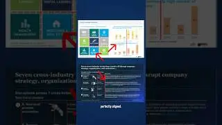
The second reason is they match the chart to the message. In other words, when they're trying to compare values against each other, they use a bar chart. When they're trying to compare values over time, they use a column chart when they're trying to highlight a trend or a pattern. They use a line chart. And they do this consistently with every chart. And that helps make the message clear. The next thing you're really good at is drawing attention to the key insights of the chart.
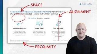
They put the key takeaway of the chart right in the title, and they make that title big and bold. Then in the chart itself, they use pretty muted colors, except for the data point.
They're trying to highlight. Even this red line at the top right here is meant to draw your eyes towards the key takeaway of the chart, which again is right in the title. So if you want to understand how to build effective charts, The Economist might just be a good place to start.
=============================================
📣 FREE STUFF
1-Month Ampler Subscription* ☞ https://bit.ly/3tFq4Ze
SlideStart (Slide Database) ☞ https://bit.ly/3HctLIM
Slide Building Course ☞ https://bit.ly/3v5vcCZ
Umbrex Template ☞ https://bit.ly/3S7dxar
🏆 COURSES
Presentation Design Course ☞ https://bit.ly/3UJJi88
Data Visualization Course ☞ https://bit.ly/3TKt11s
PowerPoint Speed Course ☞ https://bit.ly/3hOxjaM
Courses for Teams ☞ https://bit.ly/3H4YSGv
🎬 VIDEOS
• The 5 Most Popular Consulting Slides ...
• Why McKinsey uses blue, and other col...
• How I redesigned 3 McKinsey slides (a...
• How McKinsey creates million dollar c...
🚀 MORE STUFF
Follow us on Instagram ☞ https://bit.ly/3H7S3ny
Connect on LinkedIn ☞ https://bit.ly/41T7SIk
Paul's LinkedIn ☞ https://bit.ly/3tyAOsr
*Affiliate relationship
=============================================
ABOUT US
At Analyst Academy, we teach high-value consulting skills found at the world's top consulting firms. Our clients include small businesses, Fortune 500 companies, universities, and individual students in 100+ countries around the world. Each of our courses combine years of knowledge from high-performing consultants into highly engaging lessons packed full of best practices, time-saving tricks, and some of the industry's best kept secrets. Our downloads, courses, and articles are all inspired by best practices from the consulting industry. Learn more at https://www.theanalystacademy.com
All views expressed on this channel are that of Analyst Academy LLC and its employees. Any materials mentioned or shown have been obtained through publicly available sources (e.g. firm or client website).
#powerpoint #presentations #consulting #datavisualization