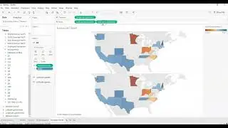
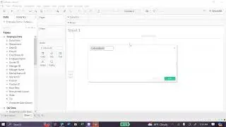
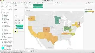
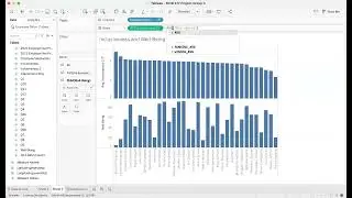
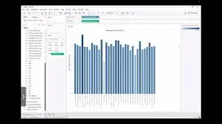
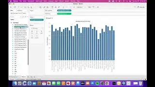
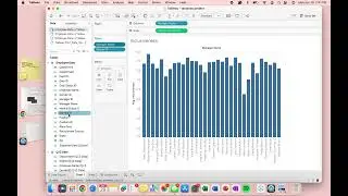
13-Bar Chart
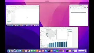
In this video, we will go over how to create a visually appealing bar chart in Tableau. Specifically, the video focuses on the following:
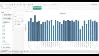
● 0:00 - 0:21: Creating a bar chart
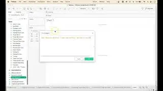
● 0:22 - 0:47: Filtering data
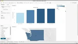
● 0:48 - 1:06: Adding color to bar chart
● 1:07 - 1:12: Using ascending/descending order tool
● 1:13 - 1:37: Titling your visualization
By the end of the video, you’ll understand how to create a bar chart, how to filter the data you want to display in the chart, and how to make your chart visually appealing and easy to interpret.
About Us:
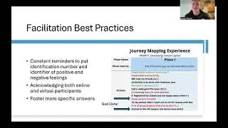
The Vandal Analytics YouTube Channel includes bite-sized, student-created, how-to videos for that moment when you are using Tableau, Python, or Excel, or preparing to perform interviews or a journey mapping exercise and need a simple reminder about how to perform a task. Learn more about Vandal Analytics and the University of Idaho’s College of Business and Economics.
#tableau #barchart #tableaututorial #tableaumac