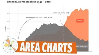
Matplotlib #1: Area charts
Let me show you how to create an area chart in matplotlib and add elements to it.
Chapters:
00:00 Intro
01:14 Import a csv with pandas
02:20 Pivot tables in pandas
02:30 Drop columns in pandas table
03:00 Get data from a pivoted column index in pandas
03:30 Get data from a column in pandas
04:30 Define the chart in matplotlib (ax method)
05:00 ax.fillbetween function matplotlib
07:18 ax.annotate Annotate function in matplotlib
07:55 ax.annotate with bbox Annotations with border matplotlib
10:33 ax.axvline Vertical line in matplotlib
11:50 ax.annotate with offset and arrow matplotlib
15:00 ax.set_ylabel - add y axis title
15:35 ax.spines - Modify the frame or spines
15:57 ax.tick_params - Change color of x-y axis labels
16:12 ax.grid -add horizonal lines to the y axis
16:20 ax.set_axisbelow(True) - send the horizonal lines to the back
16:44 ax.set_ylim - start the y axis by zero
17:10 ax.set_yticklabels -add % to the axis labels
Here you can download the power bi file used in the video:
Go to:https://curbal.com/donwload-center
Click on community downloads and get the file (same number as title)
To learn more about Power BI, subscribe to my Power youtube channel here: / @curbalen