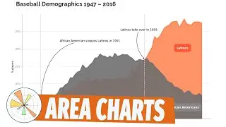
Misleading charts #2: Poor labelling on Axis
Welcome to episode 2 of our data viz/ data literacy series.
In today's video we will analyze the chart from episode 1 and present a new challenge: Should New York re-open their indoor restaurants?
The Cooper's Hawk story/chart is from "The Daily Illini: Volume 143 Issue 103" page 3A available at https://issuu.com/thedailyillini/docs...
Let me know your thoughts on the comments!
Chapters:
00:00 Intro
00:30 How to read the chart
03:02 Analyze the char
05:40 A good chart (same story)
06:40 Redesigning the chart
08:10 This week's challenge
To learn more about Power BI, subscribe to my Power youtube channel here: / @curbalen