LInkedIn Ads - Are Your Ad Creatives Legible on Mobile Devices?
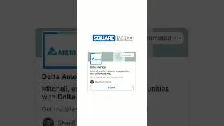
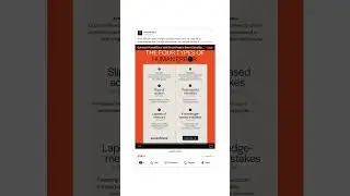
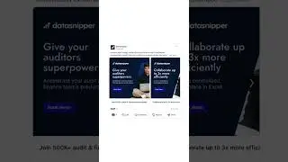
Making a quick LinkedIn Ads video to review ad legibility on mobile devices. I recommend using the square 1:1 aspect ratio for single image ads, as it shows well on mobile and desktop devices compared to wide aspect ratio ads, which don't show as well on mobile. In almost all cases, you want the font to be legible. If it's not, consider removing the font or adjusting the creative so it's more legible.
Need help with your marketing? Email me at [email protected]
Follow me on LinkedIn: / mitchell-gould
Website: https://mitchellgould.com/
00:00 Introduction
00:20 Mobile ad examples (bad)
01:50 Mobile ad example (good)
02:25 Previewing your ads on mobile
02:55 Conclusion


![[YTP] Dhar Mann loves bombs](https://images.mixrolikus.cc/video/E9LN5rcYUlo)