How to Create a Responsive Card in HTML and CSS | FreeProjects1
✅In this video, I will show you how to create a responsive card in HTML and CSS. A responsive card is a web element that can adapt its layout to different screen sizes, so it looks good on any device.
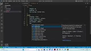
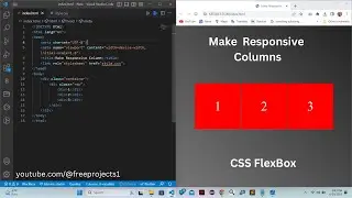
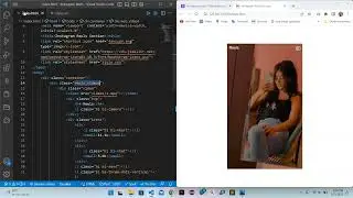
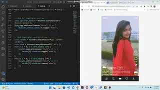
✅We will start by creating a basic card with an image, title, and description. Then, we will use CSS to make the card responsive. We will use flexbox to arrange the card's elements in a flexible way, and we will use media queries to specify how the card should be displayed on different screen sizes.
✅By the end of this video, you will know how to create a responsive card that looks good on any device.
✅Download the source code of this video: https://freeprojects1.blogspot.com/20...
✅Subscribe to our "Free Projects1" YouTube channel
/ @freeprojects1
@Free Projects1
Follow on social media also
✅GitHub: https://github.com/BHOLU-SINGH
✅Facebook: / freeprojects1
✅Instagram: / freeprojects1
✅Medium: / public
✅Blogger: https://freeprojects1.blogspot.com/
Thanks for watching…
responsive card, card design, card layout, flexbox, media queries, html, css, web development, web design, responsive web design
#responsivecard #carddesign #cardlayout #flexbox #mediaqueries #html #css #webdevelopment #webdesign #responsivewebdesign #createresponsivecard #howtocreateresponsivecard #learntocreateresponsivecard #responsivecardtutorial #carddesigntutorial #cardlayouttutorial #flexboxtutorial #mediaqueriestutorial #htmltutorial #csstutorial #webdevelopmenttutorial #webdesigntutorial #responsivewebdesigntutorial #viralvideo #videotutorial #webdevelopmenttips #webdesigntips #htmltips #csstips #programmingtutorial #programmingtips #learntocode #codingtutorial #codingtips #bholusingh #projects #free#developerbholusingh #bholusinghblogger #bholusinghgithub #webdevelopment #projects #webprojects #freeprojects1
#fp1