How to create a boxplot to represent basin scale water constituents using Python - Tutorial
Python is an interpreted high-level programming language which allows performing several statistical procedures. This programming language is an excellent option to create box plots because of its simplicity and exceptional results. This tutorial explains how to download and use Python´s Jupyter Notebook to analyze water quality data in the form of boxplots.
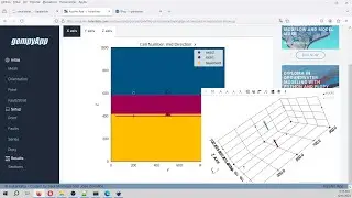
Box plots show the distribution of a sample using the lower quartile (Q1), the median (m or Q2) and the upper quartile (Q3)--and the interquartile range (IQR = Q3-Q1), which covers the central 50% of the data. Quartiles are values that divide the data in quarters; the term refers to the value that falls in the line that divides each quarter. Therefore, Q1 is the highest value of the first 25% of the data, Q2 is the one of the 50% of the data and Q3, the one for the 75% of the data. Characterizing the data with quartiles is advantageous because they are insensitive to outliers and preserve information about the center and spread (Krzywinski & Altman 2014).
Input data
You can download the input data for this tutorial here:
https://www.hatarilabs.com/ih-en/how-...