How to Create a Half Circle Chart in Excel
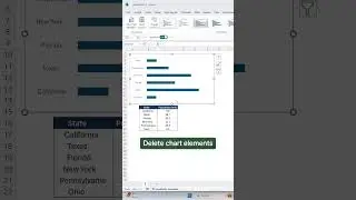
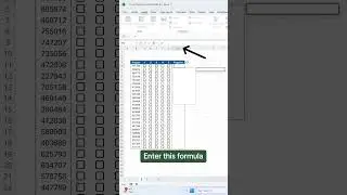
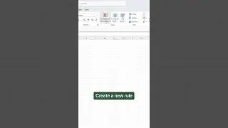
Welcome back to Plot Twist, our new Excel data visualization series where we turn boring data into unique visualizations! In the fourth episode, we cover how to create a Half Circle Chart in Excel. A Half Circle Chart is a great way to visualize progress toward a goal or impress your boss by visualizing KPIs. First, we'll go over how to set up your data table, then we'll create the Half Circle Chart, and lastly, we'll add some formatting.
📖RESOURCES
Download the workbook and follow along: https://excel-dictionary.com/pages/yo...
🤓SHOP EXCEL DICTIONARY
NEW AI FOR EXCEL COURSE OUT NOW 👉🏼 https://excel-dictionary.com/collecti...
COURSES: https://excel-dictionary.com/collecti...
-GUIDES: https://excel-dictionary.com/collecti...
-MERCH: https://excel-dictionary.com/collecti...
-TEMPLATES: https://excel-dictionary.com/collecti...
📩NEWSLETTER
-Unlock the full potential of Excel and PowerPoint with expert tips delivered to your inbox each week: https://www.excel-dictionary.com/subs...
📺SUBSCRIBE
-Subscribe to never miss a video: / exceldictionary
🕰️TIMESTAMPS
'0:00 Intro
'0:24 Half Circle Chart overview
'0:48 Set up the data
'1:13 How to create a Half Circle Chart
'2:23 Format the Half Circle Chart
'2:52 Add value to the chart
'3:45 Wrap up
#excel #exceltips #tutorial #charts #graphs #plot #plotwist


