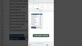
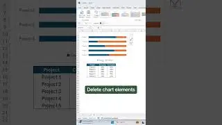
How to Create a Timeline Chart in Excel
Welcome to Plot Twist, our new Excel data visualization series where we turn boring data into unique visualizations. In the first episode, we cover how to create a Timeline chart in Excel. A timeline chart visualizes events or tasks over time by plotting them in chronological order. First, we go over how to set up the data, then how to create a Timeline Chart, and finally, how to format it to best suit your needs!
📖RESOURCES
- Download the workbook and follow along: https://excel-dictionary.com/pages/yo...
🤓SHOP EXCEL DICTIONARY
NEW AI FOR EXCEL COURSE OUT NOW 👉🏼 https://excel-dictionary.com/collecti...
- COURSES: https://excel-dictionary.com/collecti...
-GUIDES: https://excel-dictionary.com/collecti...
-MERCH: https://excel-dictionary.com/collecti...
-TEMPLATES: https://excel-dictionary.com/collecti...
📩NEWSLETTER
-Unlock the full potential of Excel and PowerPoint with expert tips delivered to your inbox each week: https://www.excel-dictionary.com/subs...
📺SUBSCRIBE
-Subscribe to never miss a video: / exceldictionary
🕰️TIMESTAMPS
‘0:00 Intro
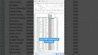
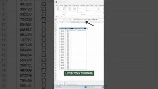
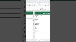
‘0:31 Setting up the data
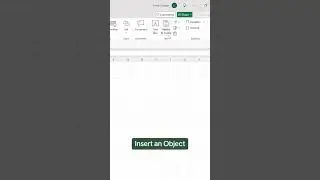
‘1:13 How to create a Timeline Chart
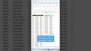
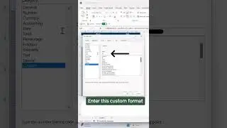
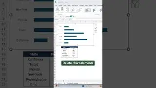
‘2:45 Format the Timeline
‘4:25 Wrap up
#excel #exceltips #tutorial #charts #graphs #plot #plotwist