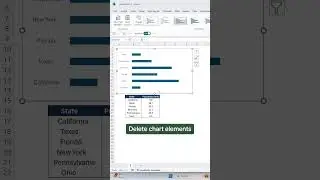
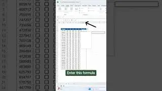
How to Create a Sliced Donut Chart in Excel
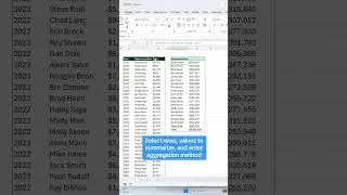
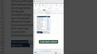
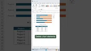
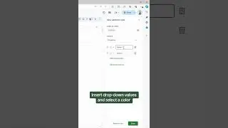
Welcome back to Plot Twist, our new Excel data visualization series, where we turn boring data into unique visualizations! In the second episode, we cover how to create a Sliced Donut Chart in Excel. A Sliced Donut Chart is an upgrade to the typical Donut Chart when tracking progress in Excel. First, we’ll cover how to insert a Donut Chart, then we’ll format the chart, and lastly, we'll go over how to give it that sliced look! 🍰
📖RESOURCES
Download the workbook and follow along: https://excel-dictionary.com/pages/yo...
🤓SHOP EXCEL DICTIONARY
NEW AI FOR EXCEL COURSE OUT NOW 👉🏼 https://excel-dictionary.com/collecti...
COURSES: https://excel-dictionary.com/collecti...
-GUIDES: https://excel-dictionary.com/collecti...
-MERCH: https://excel-dictionary.com/collecti...
-TEMPLATES: https://excel-dictionary.com/collecti...
📩NEWSLETTER
-Unlock the full potential of Excel and PowerPoint with expert tips delivered to your inbox each week: https://www.excel-dictionary.com/subs...
📺SUBSCRIBE
-Subscribe to never miss a video: / exceldictionary
🕰️TIMESTAMPS
‘0:00 Intro
‘0:34 How to create a Sliced Donut Chart
‘3:14 Add the complete percentage to the chart
‘4:13 Wrap up
#excel #exceltips #tutorial #charts #graphs #plot #plotwist