Master Histogram Charts in Excel: Step-by-Step Guide for Beginners
📊 Learn How to Create Histogram Charts in Excel!
In this tutorial, we’ll guide you through the process of creating professional histogram charts step-by-step. Whether you're analyzing data, presenting findings, or exploring distributions, this video will make it easy to use histogram charts in Excel like a pro!
🔍 What You’ll Learn:
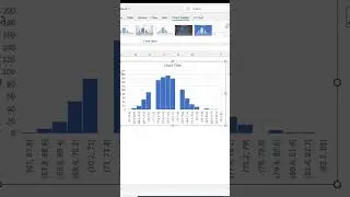
What is a histogram chart and why it's useful
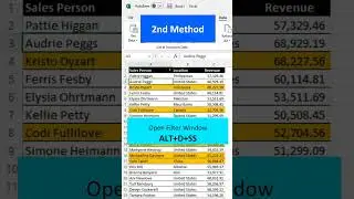
How to create a histogram in Excel in just a few clicks
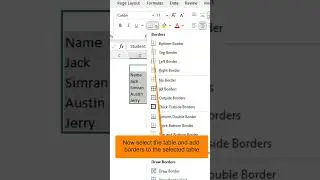
Formatting tips to make your chart stand out
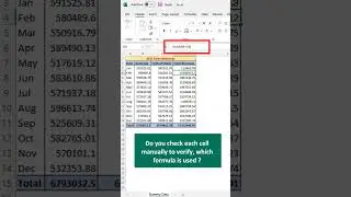
Using histograms for data analysis and decision-making
📌 Chapters:
00:00 Introduction to Histogram Charts
00:30 What is a Histogram Chart?
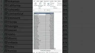
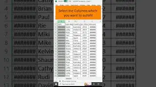
01:15 Setting Up Your Data for a Histogram
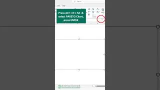
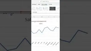
02:45 Inserting a Histogram Chart in Excel
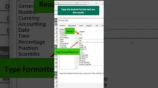
04:10 Formatting the Histogram Chart
06:05 Customizing Chart Labels and Colors
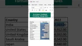
07:50 Analyzing Data with Histograms
09:20 Final Tips and Tricks
🎯 Why Watch This Video?
Make your reports more impactful with professional charts
Simplify your data analysis in Excel
Learn valuable skills for work, school, or personal projects
✨ Don’t forget to like, comment, and subscribe for more Excel tips and tutorials!
🌐 Get more resources and templates at excelsirji.com
☕ Support our channel: Buy Me a Coffee