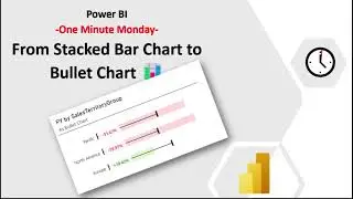
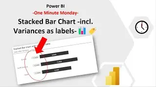
One Minute Monday - Stacked Bar Chart -incl. Variances as labels-📊🏷️
Just Video no Sound!
First thanks to @HowtoPowerBI 💕 for his amazing Video on this topic! ( • Get MORE out of Your BAR CHARTS in Po... )
My short video related to Bas Video shows very quick how to archiv this amazing variances labels in a Stacked Bar Chart.
If you want to know exactly how to and why the measures are as they are view Bas video ⬆️
Bar Chart with integrated Labels
Type: Stacke Bar Chart
Y-Axis: Segment
X-Axis: Placeholder & Sum of Revenue
Create Placeholder Measure:
Placeholder = Maxx(
ALL('Product'[Segment]),
[Revenue Total]
)/ 4
Create Up and Down Measure:
Up and Down =
VAR _Item = [% Growth]
VAR _Label =
SWITCH(
True,
_Item = 0, " " & "-",
_Item ⬅️0, " " & " "& FORMAT( _Item,"0.00%"),
_Item ➡️ 0, " " & "+" & FORMAT(ABS(_Item),"0.00%")
)
RETURN
_Label
Create Up and Down Color Measure:
Up and Down Color =
VAR _Item = [% Growth]
VAR _Label =
SWITCH(
True,
_Item = 0, "grey" ,
_Item ➡️ 0, "green",
_Item ⬅️ 0, "red"
)
RETURN
_Label
Data label: on
Series: "Placeholder"
Value: Field Value - "Up and Down Color"/ Field: "Up and Down"
Background: on - grey
Bars: Placeholder: white
Title: on Subtitle: on Divider: on + some little adjustments 😉
Have Fun!