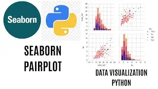
Pairplot in Seaborn | Seaborn Pairplot Tutorial using Python | Visualization with Seaborn
A Pairplot allows us to see both distribution of single variables and relationships between two variables. Pairplots are a great method to identify trends for follow-up analysis and, fortunately, are easily implemented in Python
we will walk through getting up and running with pairs plots in Python using the seaborn visualization library. We will see how to create a default pairs plot for a rapid examination of our data and how to customize the visualization for deeper insights
Visualizing Data with Seaborn Pairplot | Data Visualization with Seaborn Pairplot | Seaborn Pairplot Tutorial | Data Visualization for beginners | Visualization with Seaborn
Seaborn Pairplot Documentation:
https://seaborn.pydata.org/generated/...