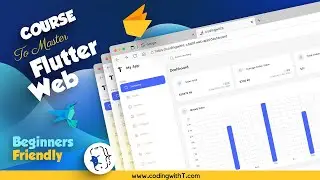
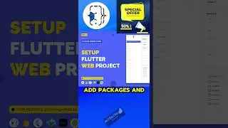
Master Responsive Design in Flutter | Create Adaptive Layouts for Desktop, Tablet, and Mobile
In this tutorial, you will learn how to create responsive Flutter layouts for desktop, tablet, and mobile devices. Build reusable widgets and master the art of designing adaptive UIs using Flutter's layout builder. Follow along as we transform our e-commerce admin panel to seamlessly fit all screen sizes. Perfect for developers looking to optimize their Flutter applications for multiple devices.
🎬 PLAYLISTS
► Complete eCommerce Admin Panel Playlist: • Master Flutter Web | Flutter Web Admi...
► Complete eCommerce App Playlist: • Professional Flutter E-Commerce App w...
❤️ E-COMMERCE APP SOURCE CODE: https://codingwitht.com/product/flutt...
ADMIN PANEL Starter Kit for FREE: https://codingwitht.com/product/flutt...
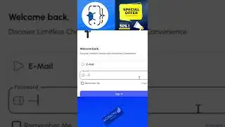
ADMIN PANEL TEST CREDENTIALS
URL: https://codingwitht-c6d0f.web.app/login
Email: [email protected]
Password: Admin@123
FLUTTER ADMIN PANEL SECTIONS
► Section - 1 (Configuration)
► Section - 2 (Navigation)
► Section - 3 (Responsive)
► Section - 4 (Admin Mgmt)
► Section - 5 (Dashboard)
► Section - 6 (Media)
► Section - 7 (Design Screens)
► Section - 8 (Firebase Backend)
► Section - 9 (Deployment)
SUBSCRIPTIONS
► Join Patreon to Access Premium Content: / membership
COURSES
► E-COMMERCE APP COURSE: • Professional Flutter E-Commerce App w...
► E-COMMERCE Admin Panel: • Master Flutter Web | Flutter Web Admi...
► FLUTTER CRASH COURSE • Flutter Crash Course for absolute beg...
► LOGIN APP FIREBASE • Flutter Login App - UI UX, Backend, F...
RELATED VIDEOS
► ROUTING AND NAVIGATION BASICS: • Basics of Flutter Routing and Navigat...
► GETX BASICS: • Master State Management in Flutter wi...
CHAPTERS
00:00 Introduction
01:55 Sections
06:50 Sidebar
07:08 Responsive Reuseable widget
10:02 Responsive Layout
FOLLOW US ON SOCIAL MEDIA
💻 Facebook | / codingwithtea
💻 Instagram | / coding_with_tea
🔍 DETAILS
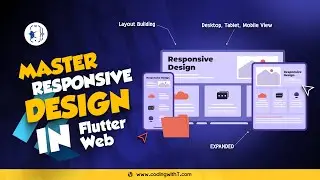
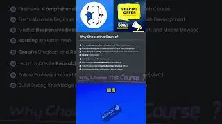
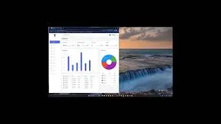
In this tutorial, we dive deep into creating responsive layouts in Flutter, specifically for e-commerce admin panels. You'll learn how to design and implement layouts that adapt seamlessly across desktop, tablet, and mobile screens. We start by exploring reusable widgets to make your design responsive for all three variants. Then, we create a unified widget called the "Site Layout" that simplifies the process, allowing you to maintain a consistent design across different screen sizes.
Throughout the video, we walk through the process of creating a responsive design using Flutter’s LayoutBuilder and custom widgets. We showcase the complete setup for a top navigation bar, sidebar, and main content area that adjusts dynamically based on screen size. By the end of the tutorial, you will have a solid understanding of how to create responsive layouts that enhance the user experience across all devices.
Key takeaways from this video include:
Building separate layouts for desktop, tablet, and mobile devices
Creating reusable widgets for responsive design
Implementing a unified "Site Layout" widget for streamlined development
Managing visibility and layout changes dynamically based on screen size
Applying best practices for responsive design in Flutter
Whether you're building a complex e-commerce admin panel or a simple app, this tutorial will equip you with the skills needed to make your Flutter applications responsive and adaptive to various screen sizes.
Don’t forget to like, share, and subscribe for more in-depth Flutter tutorials!

![[FREE FOR PROFIT] Yeat x Playboi Carti Type Beat - lyricl](https://images.mixrolikus.cc/video/q4JGz533NvY)