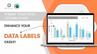
Excel Quick Tutorial: Data Labels in Column Chart
In this video from the #datatodecisions, discover how to add and customize data labels in Excel column charts with this quick tutorial.
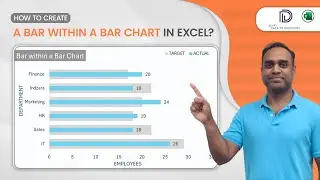
In this video, you'll learn how to display data labels to show the corresponding values directly on your columns and how to format them. Data labels provide clarity and context to your charts, making them more informative and actionable.
For a detailed guide on formatting all key elements of a column chart, check out our comprehensive tutorial here: • Formatting a Column Chart in Excel: K...
To explore our fast-growing collection of free Excel tutorials covering a wide array of topics, please visit: https://indzara.com/datatodecisions/
*****************************************************************************
Check our latest product from Indzara, the Instant Chart Maker Template - Just enter your data, and see charts getting created instantly.
https://indzara.com/product/data-visu...
*****************************************************************************
#exceltutorials #datatodecisions #columncharts #datavisualization #excelskills #excelcharts #spreadsheet #microsoftexcel #datastorytelling #dataanalysis #advancedexcel #exceltips #verticalbarcharts #formatcharts #columnchartexcel #columnchartmaker #professionalcharts
Don't forget to like, comment, and subscribe for more Excel tips and tutorials.