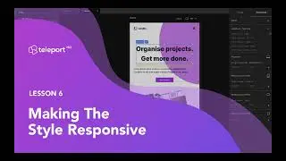
How to make a responsive navigation bar for your website
In this video, we'll show you how to make a responsive navigation bar for your website that looks great on any device 🤩 .
We'll go through the step-by-step process of creating a mobile-friendly menu that collapses neatly into a hamburger icon, and then expands into a fully-functional menu when clicked.
You don't need any coding experience to follow along – we'll be using TeleportHQ, simple and easy to use editor, and provide you with free code export for HTML, CSS, and JavaScript.
💥 By the end of this video, you'll have a sleek and functional navigation bar that will enhance the user experience on your website, no matter how your visitors are accessing it.
Browse more resources on our Help Center page: https://help.teleporthq.io/en/
👉 Register for a free account here: www.teleporthq.com
👉 Check out our Figma import tutorial here: • Figma to HTML and CSS export | Create...


![$1 Haircut VS $1000 Haircut [ASMR]](https://images.mixrolikus.cc/video/CDm9QPEAEKQ)


