Mastering Responsive Design with Flutter - Creating Adaptive Apps | Dart | Responsive Flutter App
Check Source Code
https://github.com/truecoder-001/Resp...
0:12 User Interface Designing
7:00 Check Size With Media Query
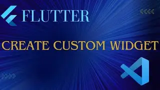
9:04 Create Custom Widget
11:29 Set height using Layout Builder.
15:00 Check Device Orientation.
20:00 Switch Widget
22:48 Adaptive Widget.
24:15 Create Custom Adaptive Widget.
24:30 Device Check
25:30 Using Cupertino
In this video, you'll learn how to create responsive and adaptive apps with Flutter, the popular mobile app development framework.
You'll explore the basics of responsive design and how to create layouts that adapt to different screen sizes and orientations.
The video covers key concepts such as media queries, layout constraints, and flexible widgets that enable you to build adaptive UIs with ease.
You'll also learn how to create custom themes and styles that respond to changes in screen size and orientation.
The video dives deep into advanced topics such as platform-specific UI elements and how to handle text scaling for accessibility.
You'll see how to implement responsive animations and transitions that enhance the user experience across different devices.
With practical examples and code snippets, you'll be able to create responsive and adaptive apps that work seamlessly on different screen sizes and devices.
Whether you're a beginner or an experienced developer, this video will give you the tools and techniques to master responsive design with Flutter and create apps that look great on any device.