7# How to Create Donut Chart in Power BI | Power BI Tutorial
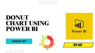
Welcome to our Power BI tutorial! In this video, we'll show you how to create a donut chart in Power BI. Donut charts are an excellent way to represent data distribution across categories while providing a visually appealing alternative to traditional pie charts.
🔹 What You Will Learn:
Introduction to Donut Charts in Power BI
Importing Data into Power BI
Creating a Donut Chart
Customizing the Donut Chart
Adding Data Labels and Tooltips
Formatting the Donut Chart for Better Visualization
Tips and Best Practices for Using Donut Charts
🔹 Why Use Donut Charts?
Donut charts are perfect for displaying parts of a whole, with the added benefit of a central blank space, which can be used for additional information or just to enhance readability.
📊 Topics Covered:
Understanding Donut Chart Structure
Data Preparation for Donut Charts
Creating and Customizing Donut Charts
Visualizing Data Effectively
Enhancing Chart Readability
Copilot with Vs Code Video: • Microsoft Copilot with Visual Studio code ...
Copilot Chatbot: • Get Employee Information with Copilot | St...
Follow Complete Power BI Playlist: • Power BI Beginner
#rpa #automation #roboticprocessautomation #microsoft #powerbi #datavisualization
