How to Draw a Cumulative Frequency Curve and Find Quartiles, Percentiles and Deciles
How to Draw a Cumulative Frequency Curve and Find Quartiles, Percentiles and Deciles
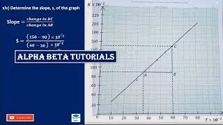
Welcome to our tutorial on mastering the cumulative frequency curve! In this video, we will guide you step-by-step on how to plot a cumulative frequency curve using a dataset, and demonstrate how to accurately determine quartiles, percentiles, and deciles from the curve.
What You'll Learn:
Understanding Cumulative Frequency: Learn the concept of cumulative frequency and how it helps in analyzing data distribution.
Constructing the Cumulative Frequency Table: We'll show you how to create a cumulative frequency table from a given dataset.
Plotting the Cumulative Frequency Curve: Follow along as we plot the cumulative frequency curve on a graph, illustrating each step in detail.
Finding Quartiles: Discover how to locate the first quartile (Q1), median (Q2), and third quartile (Q3) on the curve.
Calculating Percentiles: Understand the method to determine any percentile (e.g., 25th, 50th, 75th) from the cumulative frequency curve.
Identifying Deciles: Learn how to find the 10 deciles, which divide the dataset into ten equal parts, using the curve.
Whether you're a student, teacher, or data enthusiast, this video will equip you with the skills to analyze and interpret data using cumulative frequency curves effectively. Don't forget to like, subscribe, and hit the notification bell to stay updated with more educational content!
#DataAnalysis #Statistics #CumulativeFrequency #Quartiles #Percentiles #Deciles #DataVisualization #MathTutorial #EducationalVideo #LearnStatistics #Graphing #MathHelp #DataScience #MathEducation #StatisticalAnalysis