Call Center Performance Dashboard In Excel
Unlock Call Center Success with Call Center Performance Dashboard In Excel!
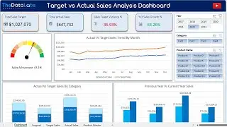
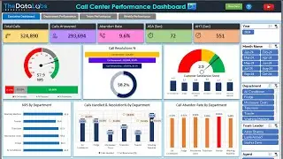
Join us in this video as we walk you through a comprehensive Call Center Performance Dashboard designed in MS Excel and Power Pivot! Discover how to leverage DAX for KPI calculations and gain valuable insights to optimize your call center operations.
What You’ll Explore:
Stunning visualizations, including Gauge Charts, Dynamic Line Charts, Trend Analysis Charts, Speedo Meter Charts, and more!
Easy performance analysis with Slicers to filter by Week, Department, Team Leader, and Date.
#dashboard #callcenterDashboard
A detailed overview of key metrics to elevate your call center performance.
🔗 Download the Premium Dashboard Here:
https://thedatalabs.org/call-center-p...
We’d love to hear your thoughts! Share your feedback or suggestions in the comments below. For any inquiries, contact us at [email protected].
Thanks for watching! If you found this video helpful, please like, share, comment, and subscribe for more insights. Have a fantastic day!


![Ultimate To-Do List and Daily Activity Tracker in Excel and VBA [Premium Tool] - Short Introduction](https://images.mixrolikus.cc/video/koVWp92LR2I)
![Ultimate To Do List and Daily Activity Tracker in MS Excel and VBA [Premium Tool]](https://images.mixrolikus.cc/video/ybwqxlBxGSU)