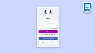
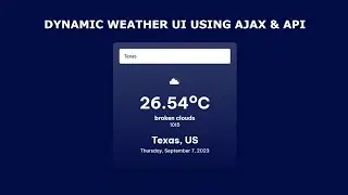
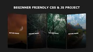
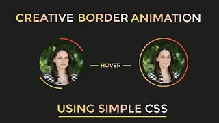
Creative Carousel Design using HTML & CSS
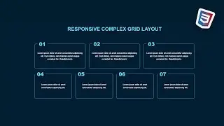
Welcome to our comprehensive tutorial on responsive web development! In this video, we'll guide you through the process of building fluid layouts using Flexbox, without the need for media queries. Whether you're a beginner or an experienced developer, this tutorial will equip you with the knowledge and techniques to create stunning, responsive designs that adapt beautifully to different screen sizes.
Throughout the tutorial, we'll cover essential concepts of Flexbox and demonstrate practical examples, showing you how to achieve dynamic responsiveness without relying on media queries. You'll discover the power and simplicity of Flexbox as we guide you through step-by-step instructions, ensuring a solid understanding of the concepts.
Stay tuned for more tutorials and web development content. Don't forget to subscribe to our channel and turn on the notification bell to never miss an update!
Tags: responsive web development, fluid layouts, Flexbox tutorial, responsive design without media queries, responsive web design, web development, CSS Flexbox, responsive layouts
Music used in this video :-
Track: JPB - Get Over You (feat. Valentina Franco) [NCS Release]
Music provided by NoCopyrightSounds Watch: / z2e 32dkoWU
Free Download/Stream: http://ncs.io/GetOver YouYO
My setup :-
Headphone - boat ( 600rs).
Laptop - HP.
Editing software - Filmora X.
Code editor - visual studio code.
Browser - Google Chrome.
Social media :-
GitHub :- https://github.com/apurbadeka1255
Pinterest :- https://pin.it/oZP476z
Other playlist:-
Figma
• Figma
Project
• Project
Javascript game
• Javascript projects
C program
• C programming language program
Hashtags: #ResponsiveWebDevelopment #FluidLayouts #FlexboxTutorial #NoMediaQueries #ResponsiveDesign #CSSFlexbox #WebDevelopment #WebDesign

