Creating a Divi Vertical Menu with Top Bar
Create stunning layouts by combining Vertical and Horizontal navigation in Divi!
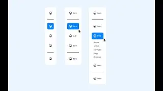
In this tutorial, you'll learn how to design a fully responsive navigation menu, from header to your favorite Divi modules.
CODE USED:
COLUMN
display: flex;
flex-direction: column;
justify-content: center;
height: 100%;
background: red;
HEADER SETTINGS
@media (min-width: 981px) {
html:not(.et-fb-preview--wireframe) #et-main-area {
margin-left: 25vw;
width: calc(100% - 25vw);
height: calc(100vh - 100px);
overflow-y: auto;
position: fixed;
bottom: 0;
border: 5px solid black;
}
}
Unleash your creativity and... Happy building! 🥳
WATCH ALSO:
👉 Revealing a Fixed Vertical Navigation from a Horizontal DiviMenu
• Revealing a Fixed Vertical Navigation from...
👉 Slide In a Sidebar Menu
• Slide In a Sidebar Menu
Learn more:
https://dondivi.com/documentation/div...
Divi Marketplace
https://www.elegantthemes.com/marketp...
____
💜 DonDivi
We create premium tools for improving your creativity and simplifying the way to design stunning websites with Divi.