From histograms to dashboards: An introduction to data visualization with Python
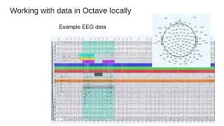
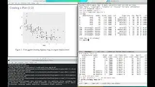
Explaining the insights of data can be performed in a myriad of ways. You can write many paragraphs trying to convey the idea. You can supplement this with tables, and let the reader figure it out carefully. As primates, however, we are visual beings, and the insights are better shown in images. This step is usually tricky since choosing the right (minimal) set of figures to tell a compelling story is challenging. One of the challenges is to even get started with the exploration. In this webinar we will be introducing you to visualization with Python, starting with simple histograms using Pandas and Matplotlib, and moving all the way to interactive dashboards with Streamlit. Here we will not delve into details, but it will work as an amuse-bouche to get you started in your journey with data visualization.
_______________________________________________
This webinar was presented by Jose Sergio Hleap (SHARCNET) on January 26th, 2022, as a part of a series of regular biweekly General Interest webinars ran by SHARCNET. The webinars cover different high performance computing (HPC) topics, are approximately 45 minutes in length, and are delivered by experts in the relevant fields. Further details can be found on this web page: https://helpwiki.sharcnet.ca/wiki/Onl... . Subscribe to our twitter account (@SHARCNET) to stay updated about our upcoming webinars.
SHARCNET is a consortium of 19 Canadian academic institutions who share a network of high performance computers (http://www.sharcnet.ca). SHARCNET is a part of Compute Ontario (http://computeontario.ca/) and Compute Canada (https://computecanada.ca).


![$1 Haircut VS $1000 Haircut [ASMR]](https://images.mixrolikus.cc/video/CDm9QPEAEKQ)