How to Create a Doughnut Chart in Excel (Quick and Easy)
Today’s video tutorial offers a quick and easy way how to create a simple doughnut chart in Excel, through which you can make a clear visual representation of data. So, let’s have a look at how to do that!
Watch next video tutorial:
How to Add Chart Elements in Excel
► • How to Add a Title to a Chart in Exce...
How to visualize data in Excel
► • How to Use Color Scales in Excel (Con...
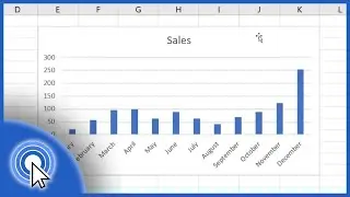
How to Make a Graph In Excel
► • How to Make a Pie Chart in Excel
================
❤️ Become a Patron:
Do you find our tutorials useful? Join this channel and become a patron
YouTube ► https://www.youtube.com/@ExcelTutoria...
================
⏱️Timestamps⏱️
0:00 How to Create a Doughnut Chart in Excel
1:10 How to Adjust the Position of the Chart Within the Excel Spreadsheet
1:22 How to Adjust the Size of a Doughnut Chart in Excel
1:35 How to Add a Chart Title in Excel
2:05 How to Change Colour and Design of the Doughnut Chart
================
Is this your first time on EasyClick? We’ll be more than happy to welcome you in our online community. Hit that Subscribe button and join the EasyClickers! :)
► / @exceltutorialseasyclickacademy
Got Microsoft Office 365? Get it here
► https://www.easyclickacademy.com/buy-...
Connect:
LinkedIn ► / easyclickacademy
Facebook ► / easyclickacademy
Screen Recorder & Video Editor:
Camtasia ► https://techsmith.pxf.io/c/1266206/34...
#MicrosoftExcel #ExcelQuickAndEasy #EasyClickAcademy