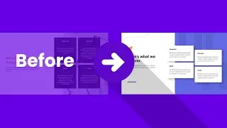
How to Design a SICK Dashboard UI in Figma
https://bit.ly/3fURuDf 👈 Learn UI/UX Today. Use "UI2022" for 22% Off!
-- Today, I'm going to fulfill a long-awaited request from many of you, and that's how to design a dashboard from scratch in Figma. If you're interested in seeing how to really make it responsive and interactive, check out designcourse.com, as it will be available in the curriculum within a week of uploading this video!
Project file:
https://coursetro.s3.amazonaws.com/st...
(Download this, save to a folder, drag it on top of the main home dashboard within the Figma app to open it)
0:00 - Introduction
1:16 - Getting Started
2:58 - Light vs Dark Considerations
5:04 - Navigations
16:00 - Card Designs
31:37 - Chart Design
34:20 - Final Thoughts
Let's get started!
#dashboard #ui #figma
- - - - - - - - - - - - - - - - - - - - -
Subscribe for NEW VIDEOS!
Learn UI/UX: https://designcourse.com
My personal FB account: http://fb.com/logodesigner
Coursetro FB: http://fb.com/coursetro
Coursetro's Twitter: / designcoursecom
Join my Discord! / discord
^-Chat with me and others
- - - - - - - - - - - - - - - - - - - - -
Who is Gary Simon? Well, I'm a full stack developer with 2+ decades experience and I teach people how to design and code. I've created around 100+ courses for big brands like LinkedIn, Lynda.com, Pluralsight and Envato Network.
Now, I focus all of my time and energy on this channel and my website Designcourse.com.
Come to my discord server or add me on social media and say Hi!


