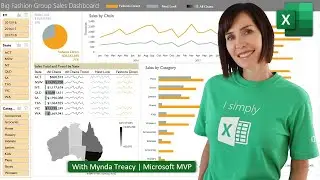
Excel Chart Mistakes That Make Data Experts Cringe
10 signs that show you’re a chart amateur and the chart formatting you should use instead.
👩🏫 Learn more with my Excel courses: https://bit.ly/badcharts23courses
⬇️ Download the example file here and follow along: https://bit.ly/badcharts23file
A lot of people send me their Excel files asking for help or feedback on their reports. And in those files, I see a lot of bad charts. It’s enough to drive a person to drink. So, I decided to compile a dossier of the 10 telltale signs that you’re a chart amateur and the techniques you should use instead, so you can up your chart game to pro level.
LEARN MORE
===========
📰 EXCEL NEWSLETTER - join 450K+ subscribers here: https://www.myonlinetraininghub.com/e...
🎯 FOLLOW me on LinkedIn: / myndatreacy
💬 EXCEL QUESTIONS: Get help on our Excel Forum: https://www.myonlinetraininghub.com/e...
⏲ TIMESTAMPS
==============
0:00 Introduction
0:26 Purpose of Charts
0:42 3D Effects
0:59 Chart Styles
1:12 Axis Starting Point
2:07 Axis Labels
2:15 Sorting
2:21 Wrong Chart Choice
2:30 Labels
2:37 Legends
2:48 Titles
3:04 Gridlines & Axis
#Excel #ExcelChart #ExcelCharts