MOST CREATIVE Percent Charts in Google Sheets 📊 Step-by-Step Tutorial | Free template included
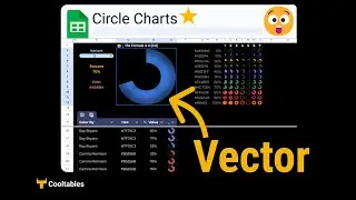
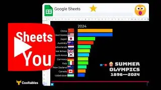
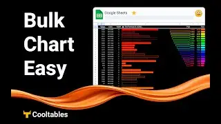
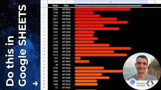
Looking for a unique way to display data in Google Sheets? In this tutorial, we'll show you how to create a visually striking diagonal block chart using conditional formatting, custom number formats, and a special formula that’s ready to use – no need to understand the math behind it!
🎁 Get Started: Download this pre-made chart template from the Cooltables Add-on (find it under Extensions → Cooltables). Link to the add-on is in the description so you can explore this template and more!
In this video, you’ll learn:
How to set up a square grid layout in Google Sheets
How to apply conditional formatting to visually represent percentages
A trick to hide numbers in cells for a cleaner look using ;;;
How to adjust values to make your chart dynamic
Whether you’re new to Google Sheets or looking to add a fresh visualization to your reports, this unique diagonal chart will make your data stand out.
👉https://www.cooltables.online
Addon download page:
https://workspace.google.com/marketpl...
follow:
/ max__makhrov
/ max-makhrov
📌 Tags: #GoogleSheets #DataVisualization #GoogleSheetsTips #ConditionalFormatting #ChartsInGoogleSheets #Cooltables #GoogleSheetsTutorial #DataCharts #SpreadsheetTips #TaxicabGeometry #BeginnerTutorial #GoogleAddOns


![Bartosz Domiczek - D2 Talks #33 [interviewed by Fabio Palvelli]](https://images.mixrolikus.cc/video/_sQkFBCvblE)