How to Create a Stacked Bar Chart with Python, Matplotlib, and Pyplot
How to Create a Stacked Bar Chart with Python, Matplotlib, and Pyplot
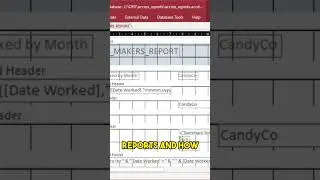
In this episode, we’re going to learn how to make a simple stacked bar chart in Python, using matplotlib and pyplot. This method will show the simplest way to make a stacked chart by actually stacking your bars from your groups individually. Also, we’ll get our data from a Microsoft Access database using pyodbc, just like you would typically do in a production setting, whether your database was MS Access, SQL Server, or another database. Thanks to one of our subscribers for this suggestion!
Follow us on social media:
/ mackenziedataanalytics
/ seamacke
/ seamacke
/ psmackenzie
Get Microsoft Office including Access:
https://click.linksynergy.com/fs-bin/...
Got a YouTube Channel? I use TubeBuddy, it is awesome. Give it a try:
https://www.tubebuddy.com/seanmackenz...
/ seamacke
Data Project? Contact me today!
#pythonbarchart #matplotlib #datavisualizationpython #pyplot
• How to Create a Stacked Bar Chart wit...