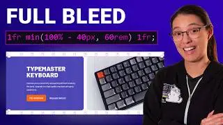
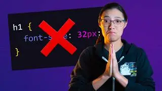
px vs rem: what to use for font-size in your CSS
🔥 My course: Responsive Design for Beginners! https://coder-coder.com/responsive/
💻 Become a full-stack web dev with Zero to Mastery: https://academy.zerotomastery.io/a/af...
In this video I talk about why I use the rem unit instead of px (pixels) for font-size in my CSS styles. And I show you how I use rems and convert them to px in my Sass/SCSS workflow!
0:00 - intro
0:48 - how to change base font size in the browser
1:45 - font-size computed with rem units is accessible
3:32 - using px for font-size is not accessible
5:09 - why not just use zoom?
6:24 - absolute and relative units in CSS
7:22 - how em differs from rem
11:21 - the 62.5% hack for easier px to rem conversion
13:32 - I use a Sass function to convert instead
____________________________
SUPPORT THE CHANNEL
⭐ Join channel members and get perks: / @thecodercoder
👏🏽 Hit the THANKS button in any video!
🎨 Get my VS Code theme: https://marketplace.visualstudio.com/...
WANT TO LEARN WEB DEV?
Check out my courses:
🌟 Responsive Design for Beginners: https://coder-coder.com/responsive/
🌟 Gulp for Beginners: https://coder-coder.com/gulp-course/
RECOMMENDATIONS
⌨ My keyboard-- get 10% off with code THECODERCODER -- https://vissles.com/?ref=mu96kxst5w
💻 Other gear -- https://www.amazon.com/shop/thecoderc...
📚 My Favorite Books -- https://coder-coder.com/best-web-deve...
📺 My Favorite Courses -- https://coder-coder.com/best-web-deve...
🔽 FOLLOW CODER CODER
Blog -- https://coder-coder.com/
Twitter -- / thecodercoder
Instagram -- / thecodercoder
#webdevelopment #coding #programming