Latest Elementor Flexbox Container Tutorial 2023 | Complex Layout Design Elementor
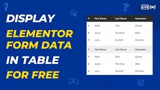
How to make beautiful search page with form using elementor - • How to make a custom SEARCH PAGE usin...
How to customize dashboard UI - • Best Wordpress DASHBOARD CUSTOMIZATIO...
How to make mega menu using elementor - • How to make Mega Menu using Elementor...
How to make beautiful Slider using elementor - • How to make beautiful SLIDER using SL...
Elementor is a popular WordPress page builder plugin that allows you to design and customize your website visually without writing code. The Flexbox feature in Elementor allows you to create flexible and responsive layouts easily. Here's a step-by-step guide on how to use the Elementor Flexbox container:
Step 1: Install and Activate Elementor
Ensure you have Elementor installed and activated on your WordPress website. If you don't have it, you can download and install it from the WordPress plugin repository.
Step 2: Create or Edit a Page with Elementor
Go to your WordPress dashboard, and either create a new page or edit an existing one using Elementor.
Step 3: Add a Section
In the Elementor editor, you'll see a canvas where you can design your page. To use Flexbox, you'll need to add a section first. Click on the "+" icon or the "Add New Section" button to insert a new section.
Step 4: Choose a Structure
After adding a section, a popup will appear with different layout structures. Choose the structure that suits your design needs. For Flexbox, you'll usually want to pick a structure with multiple columns.
Step 5: Customize the Section
Once you select a structure, the section will be added to the canvas. Now you can customize it by clicking on the section handle (the blue bar at the top) to access the Section Settings.
Step 6: Set Flexbox Layout
In the Section Settings panel, you'll find the "Layout" tab. Click on it, and you'll see the "Flexbox" option.
Step 7: Enable Flexbox
Toggle on the "Flexbox" option, and you'll see the flexbox-specific settings appear.
Step 8: Flex Direction
Choose the flex direction from the available options: Row, Column, Row Reverse, or Column Reverse. This determines whether the flex items should flow horizontally or vertically.
Step 9: Justify Content
This setting controls how the flex items are distributed along the main axis. Options include Start, Center, End, Space Between, Space Around, and Space Evenly.
Step 10: Align Items
This setting determines how the flex items are aligned along the cross axis. You can choose from Start, Center, End, Stretch, or Baseline.
Step 11: Flex Wrap
Toggle on "Flex Wrap" if you want the flex items to wrap to the next line when they reach the edge of the container.
Step 12: Additional Flexbox Options
You may find additional options like "Reverse Columns," "Order," and "Equal Height" depending on the version of Elementor you are using. Adjust these settings as per your layout requirements.
Step 13: Add Content to Flex Items
Now that your Flexbox container is set up, you can start adding content to the individual columns or containers within the section. Click on the "+" icon inside each column to add widgets, images, text, or any other Elementor element.
Step 14: Preview and Publish
After you've finished designing your Flexbox container and added content to the columns, click the "Preview" button to see how it looks. If you are satisfied with the result, save the changes and publish the page.
That's it! You've successfully created a Flexbox container using Elementor, and now you have a flexible and responsive layout for your WordPress website. Remember that the available settings and options may vary slightly depending on the version of Elementor you are using, but the general principles of using Flexbox remain the same.
#elementor #flexbox #wordpress