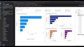
100 percent Stacked Column Chart Power BI
Published on Oct 20, 2019:
In this visual, we learn about when to use the 100 percent(%) stacked column chart.
We create the 100 % stacked column chart. We show the sales by year and how each country forms part of the stack.
In this visual, we will learn about the Heat map option for ARCGIS map visual in Power BI.
We can change the look and feel for this visual by changing the map type.
Previous Video: NA
Learn Power BI by following this series:
https://goo.gl/g8U2eh
You can download power bi desktop from here.
https://powerbi.microsoft.com/en-us/
You can down load the file from the github repository by clicking on this link:
https://github.com/learn2excel/PowerBI
File Name: 100% Stacked Column Chart Power BI.pbix
You can download the dataset from the below link and create your own power bi file.
https://bit.ly/2k67pSC
SUBSCRIBE to learn more about Power BI,Power Query, Power Pivot, Excel,SQL Server and Python!!
/ @learnexcelrelentless
Our Playists:
SQL Playlist :https://goo.gl/PS5Ep6
DAX PlayList : https://goo.gl/S4W41D
Power BI PlayList: https://goo.gl/dXxvnB
Power Query Playlist: https://goo.gl/5QS7P4
Getting Started with Power BI:https://goo.gl/GHakLZ
Getting Started with Python: https://goo.gl/n24P3w
Let us Power BI: https://goo.gl/MBE7MB
ABOUT DAGDOO:
Website:
Home Page: http://www.dagdoo.org/
Power BI Tutorials: http://www.dagdoo.org/excel-learning/...
Questions? Comments and SUGESTIONS? You will find me here:
Twitter: @dagdooe
Category: Science & Technology
License: Standard YouTube License