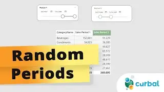
Create allocation table and visualize it in a Gantt Charts with matrix in Power Query
In this video I will show you how you can create an allocation table in Power query and display the results in a Gantt chart using only the Matrix available in Power BI.
Here you can download all the pbix files: https://curbal.com/donwload-center
SUBSCRIBE to learn more about Power and Excel BI!
/ @curbalen
Our PLAYLISTS:
Join our DAX Fridays! Series: https://goo.gl/FtUWUX
Power BI dashboards for beginners: https://goo.gl/9YzyDP
Power BI Tips & Tricks: https://goo.gl/H6kUbP
Power Bi and Google Analytics: https://goo.gl/ZNsY8l
☼☼☼☼☼☼☼☼☼☼
POWER BI COURSES:
Want to learn Power BI? How about you take one of our courses? Here you can find the available courses:
https://curbal.com/courses-overview
☼☼☼☼☼☼☼☼☼☼
ABOUT CURBAL:
Website: http://www.curbal.com
Contact us: http://www.curbal.com/contact
▼▼▼▼▼▼▼▼▼▼
If you feel that any of the videos, downloads, blog posts that I have created have been useful to you and you want to help me keep on going, here you can do a small donation to support my work and keep the channel running:
https://curbal.com/product/sponsor-me
Many thanks in advance!
▲▲▲▲▲▲▲▲▲▲
************
************
QUESTIONS? COMMENTS? SUGGESTIONS? You’ll find me here:
Linkedin ► https://goo.gl/3VW6Ky
Twitter ► @curbalen, @ruthpozuelo
Facebook ► https://goo.gl/bME2sB
#CURBAL #SUBSCRIBE
![EF Wither Storm Add-on ,Survival [MCPE-MCBE]Wither Storm In Minecraft,EnderFoxBoy MC🦊!!!](https://images.mixrolikus.cc/video/3c6eTmnbms4)


![Cesqeaux & Tisoki - Give It To Me [NCS Release] Music provided by NoCopyrightSounds](https://images.mixrolikus.cc/video/z4QRXyMTZQs)


